
Product
What Mobilize is doing to help make organizing and volunteering accessible to all

At Mobilize, we believe that organizing and volunteering should be accessible to everyone. Making your event or action accessible to people of all abilities improves the overall experience for all supporters and ensures your message can reach as many people as possible.
To help you in these efforts, we’re committed to continuously improving the accessibility of the Mobilize platform and making it easier for supporters to comfortably attend your events and take action.
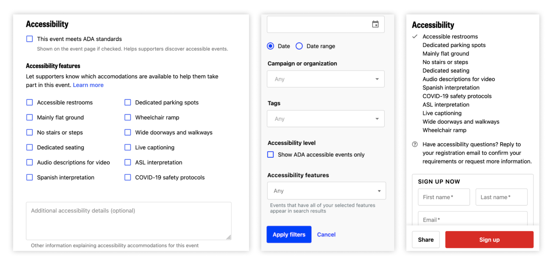
Since 2020, we’ve provided a dedicated space for event organizers to include accessibility notes and indicate whether their event meets ADA standards. While the notes have been helpful, we wanted to make it even easier for supporters with specific needs to find events as well as encourage organizers to provide specifics about available accommodations.
Now, in addition to a notes field where organizers can describe specific accommodations, organizers and volunteer hosts now have the ability to indicate which specific accessibility accommodations are available for an event, whether it is hosted virtually, in-person, or both. The accessibility feature options include physical access features such as step-free access and parking, visual and auditory aids such as live captioning and ASL interpretation, and COVID-19 safety protocols.

We’ve also put together a handy guide for event creators on providing helpful accessibility information.
On the Mobilize website, we strive to meet WCAG 2.1 accessibility guidelines and welcome feedback from our users towards achieving that goal. Recently, our product, design and engineering teams have been working to improve the accessibility of our supporter (volunteer) experiences on Mobilize. In addition to our previous work checking for adequate color contrast and utilizing the Axe linter in the development process, we’ve also been improving our site to address these W3C Checks for accessibility:
Every page on our site has a descriptive title that is…
If you or someone you know has suggestions/feedback for improving the accessibility of Mobilize or tips for organizing more accessible events, reach out to access@mobilize.us anytime. We look forward to hearing from you!