
Brand
We're excited to roll out a shiny new logo! Learn more about the changes and the reasons behind them with this behind-the-scenes look.

Hey, we’ve got a new logo! It’s still your old friend here, but with a new haircut. You can stop here if you don’t have the time to read on — we know you’ve got a lot going on, with, you know… *gestures at everything*
Still here? Sweet! Here’s why we made this change.
It’s not change for the sake of change, or aesthetics for the sake of aesthetics. Let’s be real, in the space we work in—helping people make change at the local and national levels—there’s never enough time, money, or resources. There’s no room for vanity projects. If it’s not helping our partners do their work better, if it’s not about creating a more just, inclusive, and democratic world, we don’t do it.
As the company has matured over the last several years, we’ve simply outgrown our logo. Since 2017, we’ve evolved from MobilizeAmerica, an organizing program, to Mobilize, a tech product used by thousands of political campaigns, advocacy groups, labor unions, and nonprofits. Recognizing that our users just called us “Mobilize,” we dropped the “America,” but we kept the logo mostly the same. After all, we didn’t want to be completely unrecognizable.

But as our partners expanded to include labor unions, nonprofits, school districts, and more, the stars-and-stripes logo felt too limiting once again. At its heart, Mobilize isn’t just about helping campaigns win elections; it’s about helping mission-driven groups better their communities. The nuts and bolts of the product may be forms and emails and text messages, but all those pieces are used to tap into people’s energy and channel that into volunteer power. And more and more volunteers see Mobilize as their digital home for taking action.
So our new logo tries to capture that spirit at the core of the product and the company.

If you want to get all hidden-meaning, arrow-in-FedEx-logo about it, you might be wondering: What is that squiggle? Is it a handwritten “M”? An abstract megaphone? Waves building up? The general concept of energy?
Yes, my friend. All that and more.
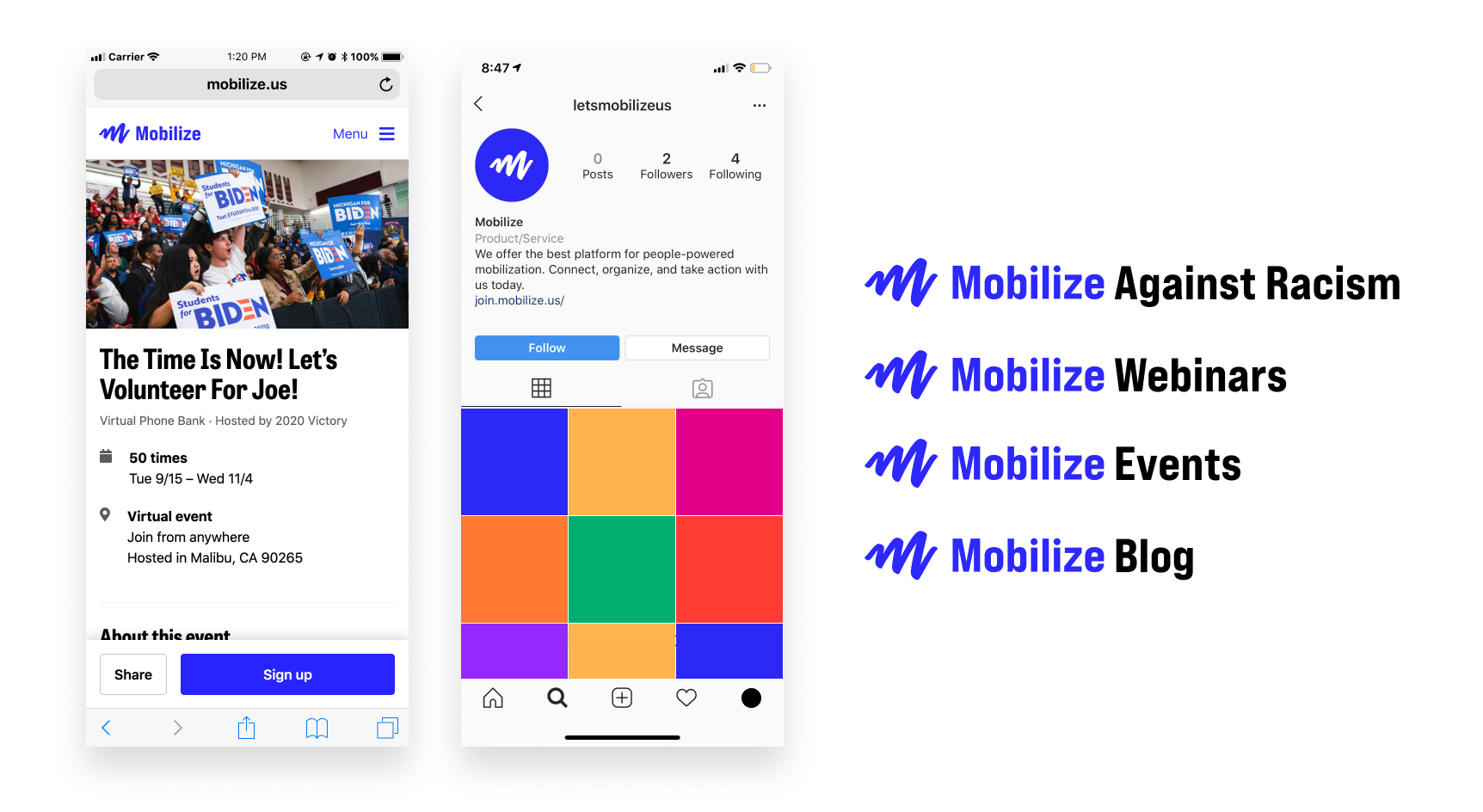
It shows up clearly at small sizes, where the previous M logo was fuzzy…

It’s easy to use in a range of applications…

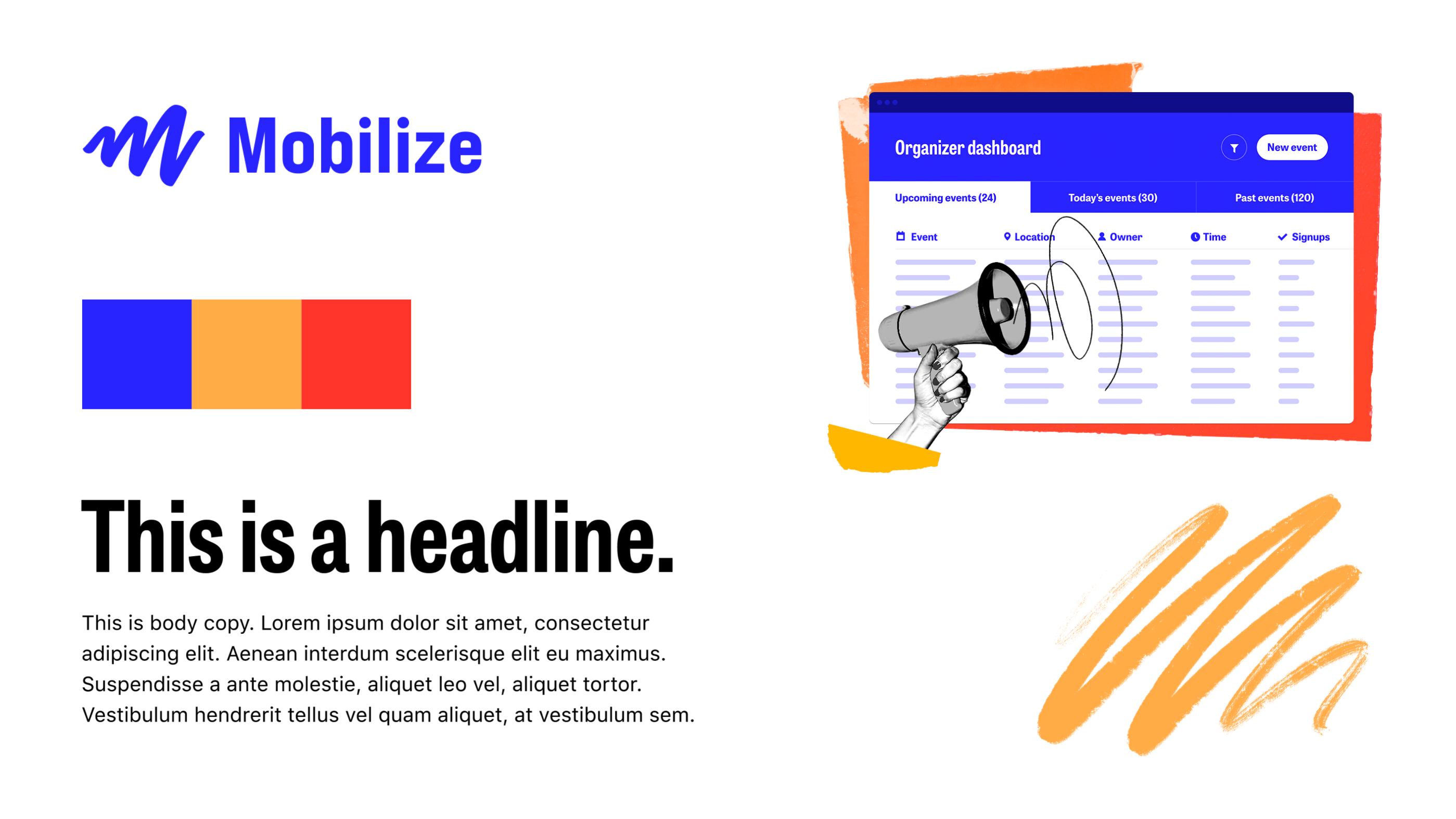
And it’s at home with the rest of our visual identity.

At the end of the day, even though logos are everywhere, they’re just a small piece of the company’s visual presentation and brand. You could even argue that for tech companies, logos hardly matter; all the big tech companies’ logos basically look the same. What really matters is the product experience, how well we serve our partners and users, and creating a healthy and supportive environment for our team. And that’s where we focus our limited time, money, and resources.
Thanks for reading, and be well.
—
P.S. Nobody asked for this, but what logo announcement is complete without some meaningless lines overlaid on the logo?
